Fixing the Samsung’s Call Experience
UX
REDESIGN
AUDIT
This personal project explores how a subtle design tweaks adding minimal visual feedback to a phone dialer can significantly enhance user clarity. It’s not about redesigning the entire interface but about recognizing and addressing a small gap that impacts the overall experience.
Role:
Design Strategist
Tools Used:
Figma, Notion
Duration:
1 week
Project Type:
Personal Project

The dialer was functional. But not communicative.
While making a regular phone call, I noticed something odd: there was no visual sign telling me if the call was connecting, ringing, being forwarded, or failing. The screen just sat there—static and silent—relying only on audio.
In noisy places or when using earphones, this lack of visual feedback creates confusion. It breaks a basic rule of usability: users should always know what’s happening.
What if one small detail could fix it?
Can I help people understand what is happening during a phone call just by adding one small visual layer? I did not want to redesign the app or add extra buttons. I was not trying to make the screen look fancy or modern. I only wanted to add a small detail that tells the user something important without changing the way they use the phone.
I believed that sometimes the smallest change can give the biggest clarity. So the real challenge was this: Can I create a better experience using as little design as possible?
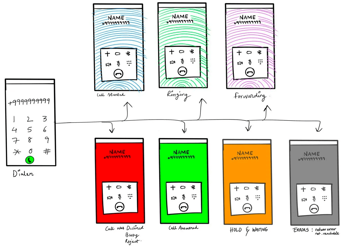
Adding the Real time feeback
Brainstorming
Explored over 20+ ideas for visual feedback, including:
• Animated progress bars
• Color-coded backgrounds for call states
• Pulsing icons and signals
• Subtle wave or ripple effects
• Spinning dots or lines to show waiting/processing
After testing and filtering, I focused on a minimalist direction using color + motion as the primary feedback method.
Clarity Through Simplicity
Designing the Visual Feedback System
Connecting
Grey arrows moving upward
Transition in progress
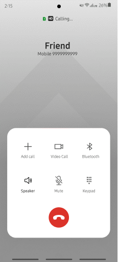
Ringing
Green arrows moving upward
Upward motion = urgency
Call Forwarding
Blue arrows moving upward
Visualizes the rerouting process
Answered
Green pulse animation
Confirmation of connection
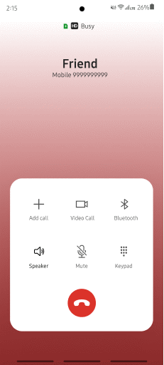
Busy / Declined
Red pulse animation
Pulse highlights attention
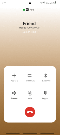
On Hold
Orange pulse animation
Gentle pulse shows it’s not over
Call Error / No Signal
Grey pulse animation
Subtle alert of issue
Designing for the Real World
To make sure the solution worked in real life, I thought about everyday situations where audio feedback might fail. In a busy train station, visual cues can replace lost sounds and help users understand what’s happening. At a loud concert, subtle animations can quietly inform without needing vibrations or headphones. And in a quiet library, gentle visuals can keep users updated without making any noise or causing distraction.
Big Impact with Small Details
This project was a reminder that tiny interactions when designed well can transform how users feel about everyday tools. By improving the visibility of system status in the dialer, I was able to:
• Make the experience more understandable
• Reduce user uncertainty and anxiety
• Improve accessibility for all environments
• Maintain a clean, familiar interface while adding depth and clarity


Designing Clarity Into Everyday Moments
This personal project focused on solving a subtle yet significant UX gap — the lack of visual feedback in call processes. By introducing minimal animations and intuitive color cues, I designed a cleaner, more informative experience without disrupting the simplicity of the dialer.
Though not formally tested, the redesign is rooted in best practices and thoughtful design decisions, clearly outlined in this case study. It reflects my ability to spot overlooked interaction problems and solve them with intention.